-
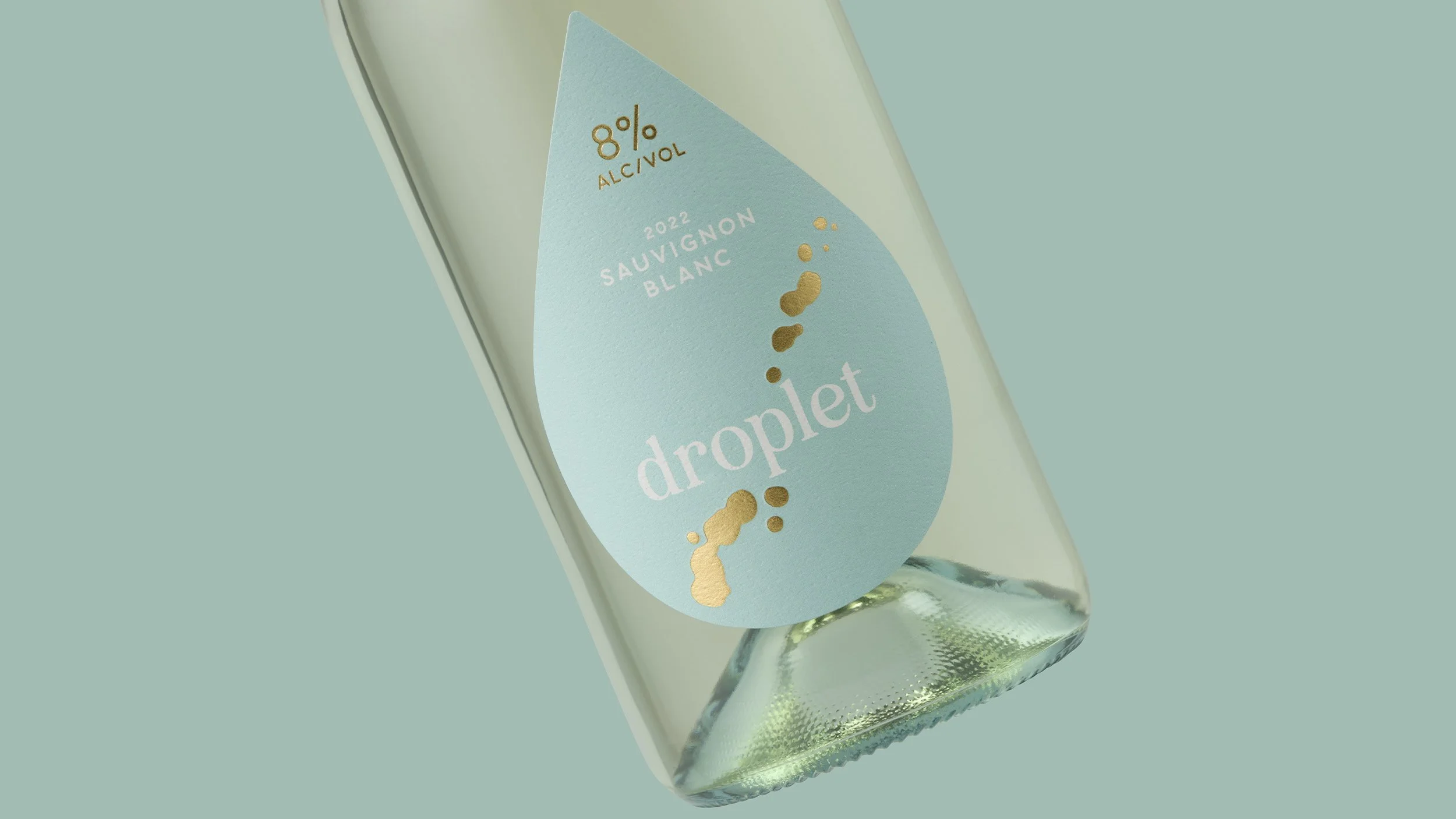
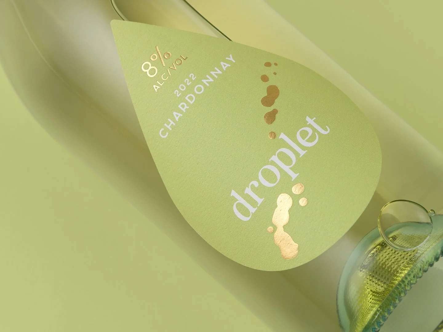
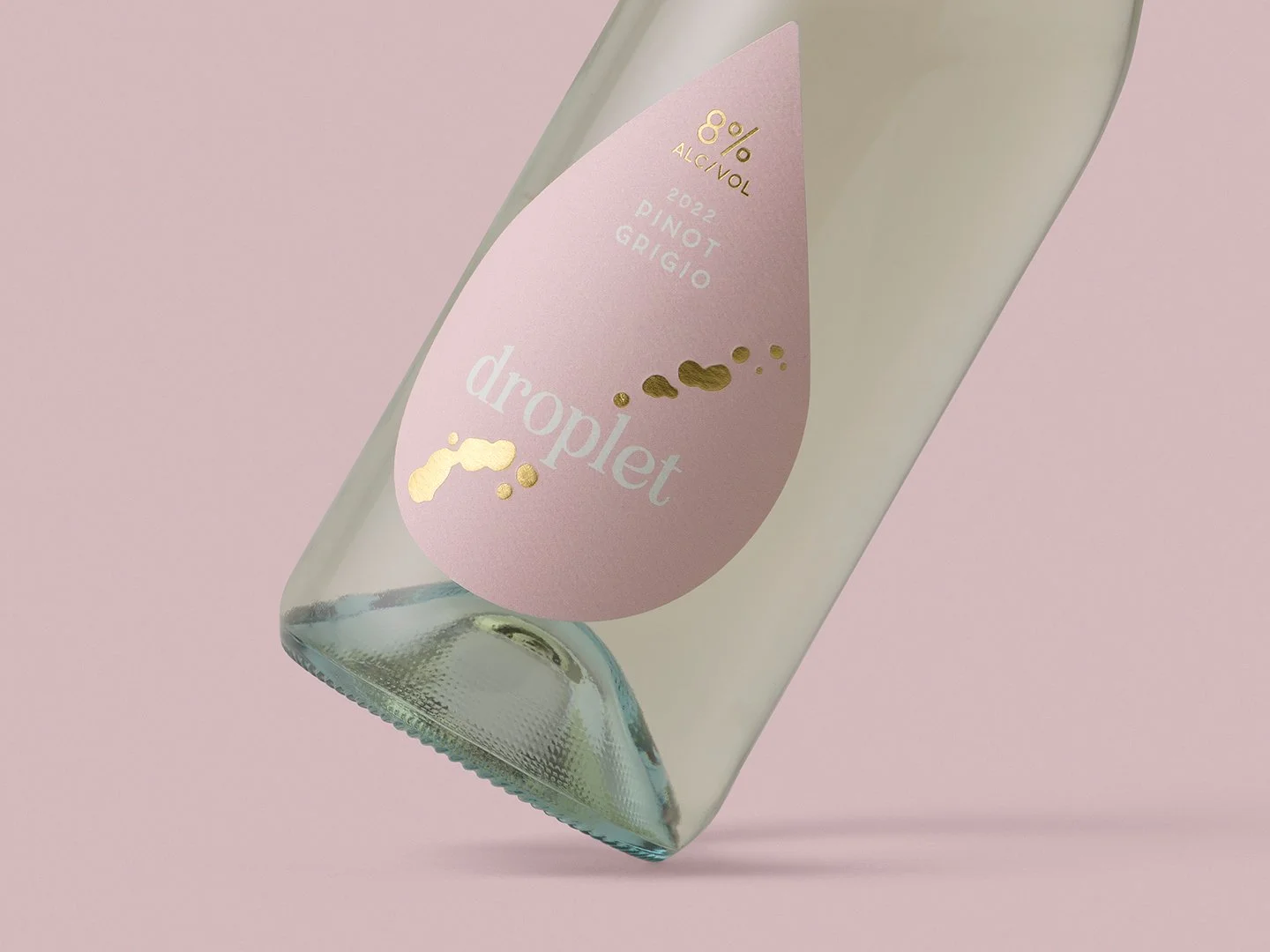
This lower alcohol range for Warburn Estate is fresh and light. The label shape speaks to the brand name as well as creating a visual difference to its competitors on the shelf. The pastel colours are reflective of the lighter alcohol offering and the drops of gold foil create a tactile interaction with the consumer.
The impact of the printed cap immediately grasped the attention of trade and consumer alike.
Droplet…just a small drop.


Previous
Previous
Alexander Hill
Next
Next